Apple
AAPL
TSLA
It’s possible that highly skilled Wall Street investment managers sporting MBAs, algorithms and fine suits are now taking advantage of the so-called “retail” crowd. That is, the time has come where profits are being taken now that Apple and Tesla are so widely owned by regular folks who just watch CNBC.
Apple and Tesla Price Chart Analysis
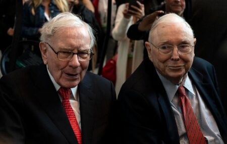
The main thing with Apple is not the latest earnings or revenues or how few iPhones got sold compared to analyst’s estimates — all that is relevant, of course, but the main thing is that this stock is Berkshire Hathaway’s
BRK.B
That “everybody knows” that it’s Buffett and Munger’s favorite keeps it top-of-mind among everyday investors who’ve placed the rest of their money in index funds. It’s a comfortable feeling knowing that over in Omaha the buy orders for shares in Tim Cook’s outfit will never stop. Or so it is thought.
Here’s the daily price chart for Apple:
The uptrend from the beginning of 2023 to July is over. The August gap down from $195 to $179 comes on heavy volume — as you can see by the big red volume bars below the price chart. That the stock crossed below its 50-day moving average (the blue line) is not a bullish look. The last time it closed below that line was way back in January. The relative strength index (RSI, below the price chart) has reached the “oversold” level suggesting that the selling may be about to ease.
The weekly chart for Apple looks like this:
Should the selling continue and gain strength, the red-dotted lines indicate possible support levels, where buyers overcame sellers last time around. The likely spots for buying show up at the $142 level (from February) and, more significantly, at the $122 level (from January). Both moving averages continue to trend upward despite this month’s selling. Note the relative strength index still has a long way to go before it becomes “oversold.”
Tesla is the other formerly hot stock that gets mentioned when people want to let you know what they own. The company’s CEO, Elon Musk, recently blew $44 billion on the social media site formerly known as Twitter, calling into question his judgement about business dealings. That he changed the name from one of the best-known brands in social media to “X” is odd. At least some of this feeling about the chief may be entering into concerns about the EV company.
The daily price chart for Tesla is here:
This is another of the formerly hot Nasdaq stocks that clearly formed a negative divergence in the June/July period between price and the relative strength index. That technical warning proved accurate as the peak of $300 has now given way to the current $249. The 2 closing prices in August below the 50-day moving average is a concern. The June support level of $240 is being tested — the next significant level of support is way down there at April’s $150 area.
Here’s the weekly chart for Tesla:
The stock peaked in October, 2021 up there at just above $400 and since then has been unable to reach that level again. The rally of this year which took Tesla from $100 to $300 is spectacular but with the recent selling, it may be another instance of an inability to climb to previous highs. Note that the 50-week moving average is about to cross below the 200-week moving average and that the relative strength index is nowhere near its “oversold” range.
Read the full article here


